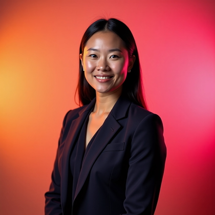
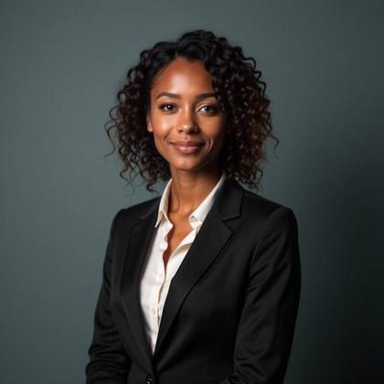
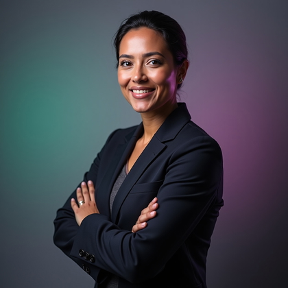
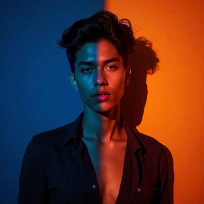
Studio Gel Lighting Portraits

Do you want AI portraits that look like real studio work instead of cheap filters
Do you want bold color, clean shape, and controlled drama that actually works in practice
Do you want prompts that give you reliable results instead of random chaos
AI photo generation is not magic. It is light, color, and shape turned into text. When you understand how studio gel lighting works in the real world, you can force AI to give you sharper faces, better skin, and stronger mood. You stop gambling with prompts. You start designing results.
This article shows how to use studio gel lighting logic inside AI. You will learn the main portrait setups that real photographers use with gels. You will see what each style does to the face, body, and background. You will understand which setups make people look powerful, soft, cinematic, strange, or hyper-modern.
You can use this to design prompts, test different looks, and build a consistent visual style. Each section explains a key gel portrait type and why it works. Then you can translate that into clear prompt language, lighting choices, and color control.
Clean One-Color Gel Headshot (Baseline Control)
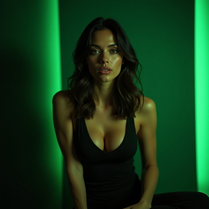
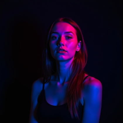
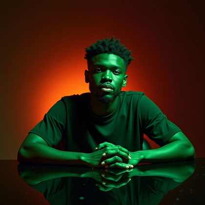
This is your starting point. One gel color. Simple head-and-shoulders framing. Face looking to camera or slightly off. No extra drama, no complex light. You use this to see how one color affects skin, eyes, and hair in AI before you stack more effects.
In practice, this setup is about control. You pick one strong tone, like cyan, magenta, or deep red. You keep the light frontal and even. You tell the AI something like “studio portrait, single color gel lighting, frontal soft light, one-color wash.” This lets you see if the model over-saturates, crushes shadows, or makes skin look plastic. Once you know how one gel behaves, you can safely add more complexity without wrecking the face.
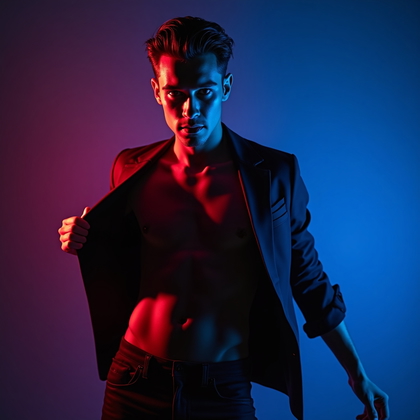
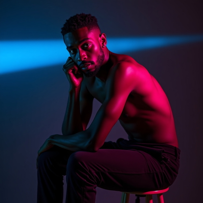
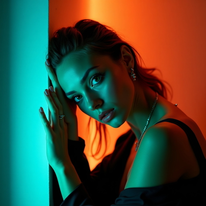
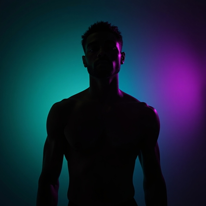
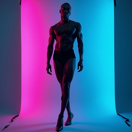
Split-Color Gel Portrait (Classic Two-Gel Look)
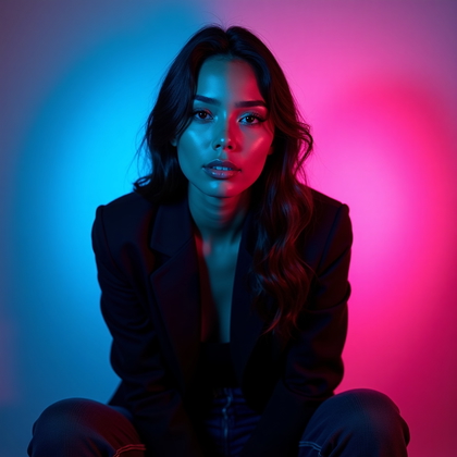
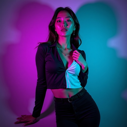
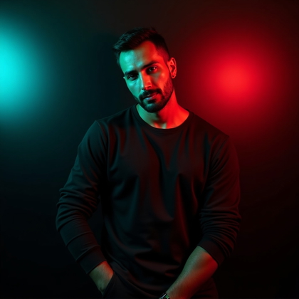
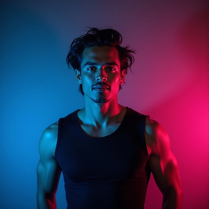
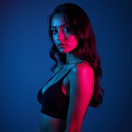
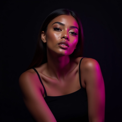
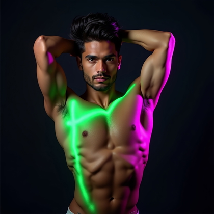
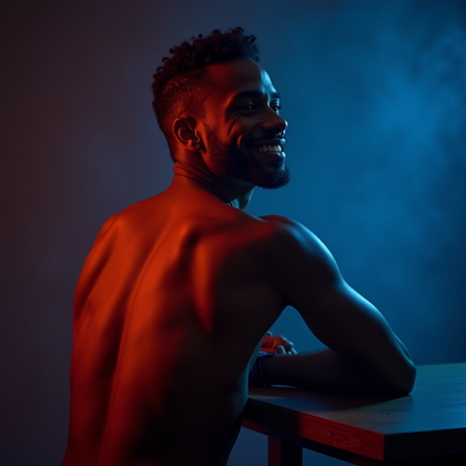
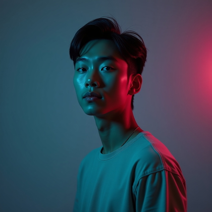
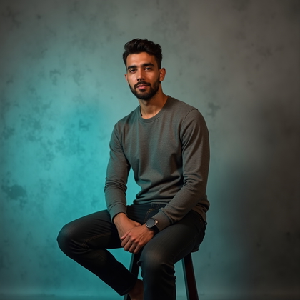
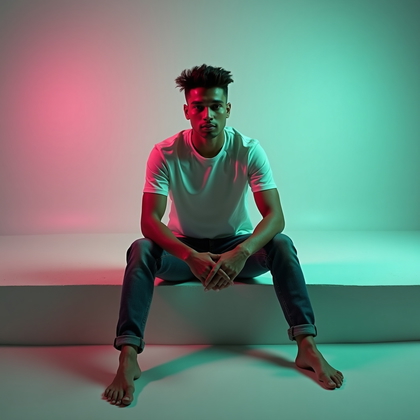
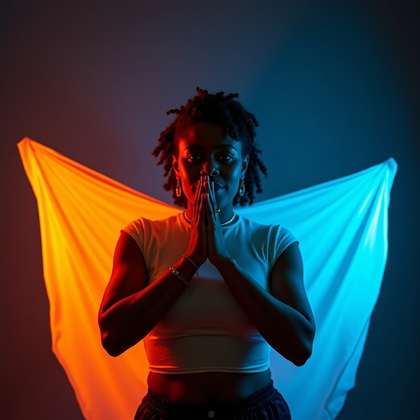
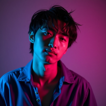
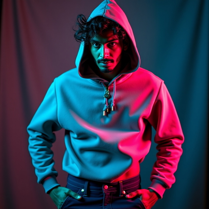
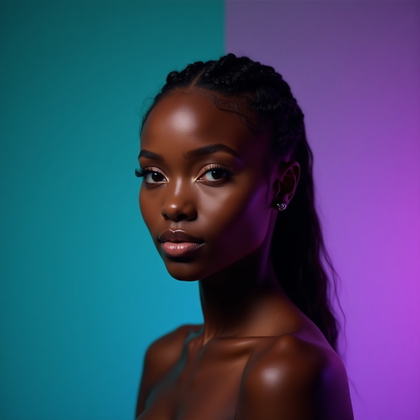
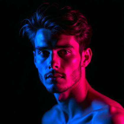
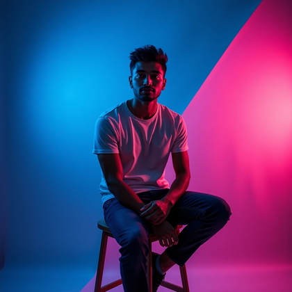
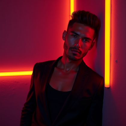
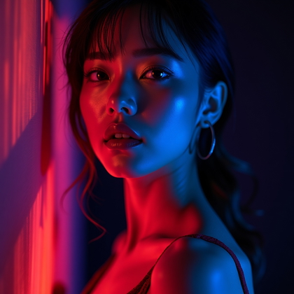
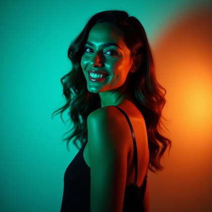
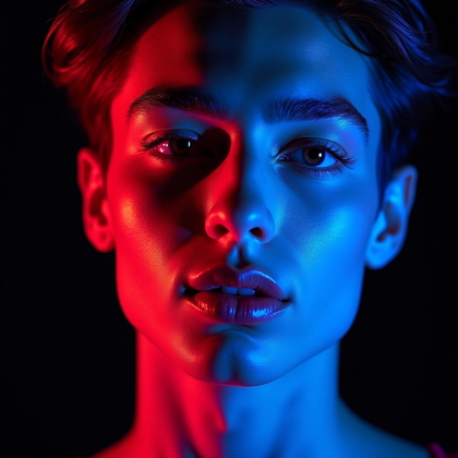
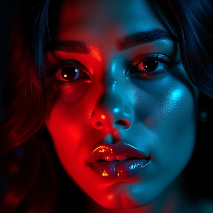
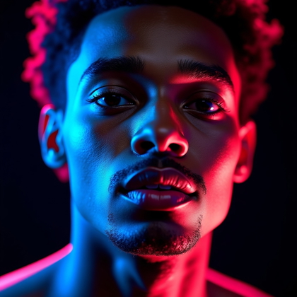
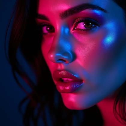
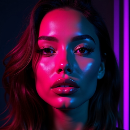
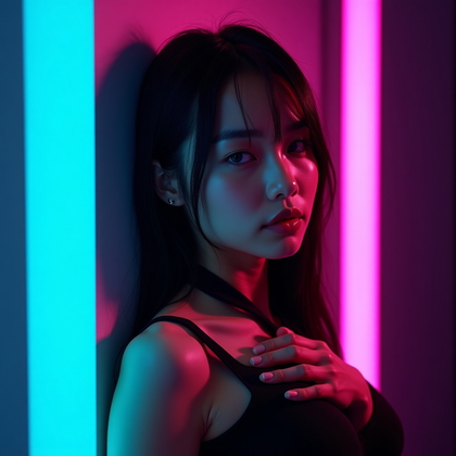
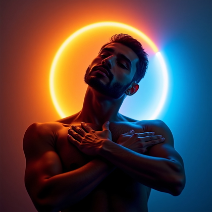
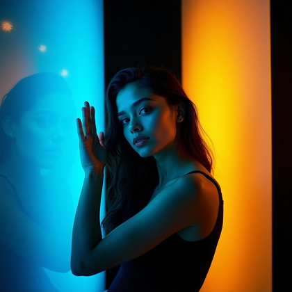
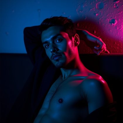
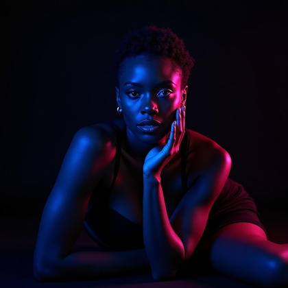
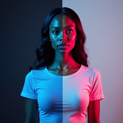
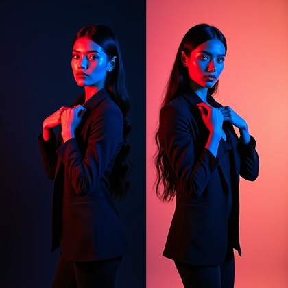
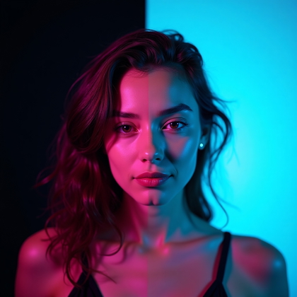
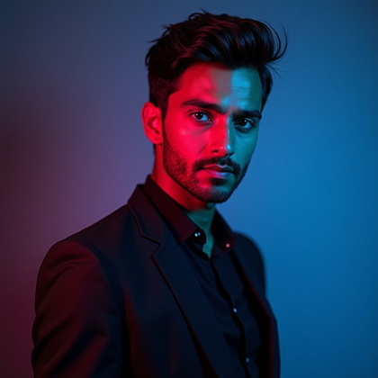
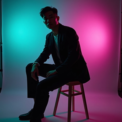
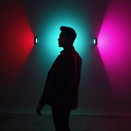
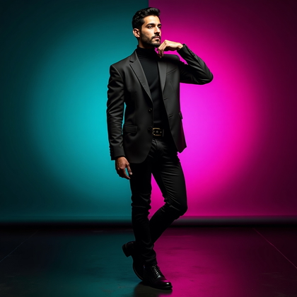
This is the classic modern gel look. One color from the left. One color from the right. Usually complementary or strongly contrasting colors like teal and magenta, blue and orange, red and cyan. This setup sculpts the face and creates strong edges and depth.
For AI, this is where you get maximum drama fast. You use terms like “split-color gel lighting, teal on one side of face, magenta on the other, two-gel studio setup, strong contrast.” The benefit is simple. One side defines cool mood. The other side defines warm or opposing mood. The chin line becomes sharper. The nose shows a clear edge. Cheekbones become more visible. The face stops looking flat and starts looking like a 3D object.
Gel Rim Light for Definition and Shape
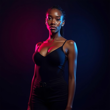
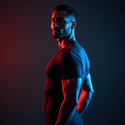
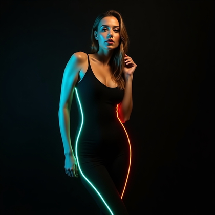
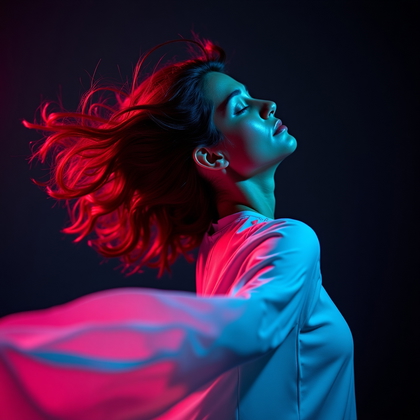
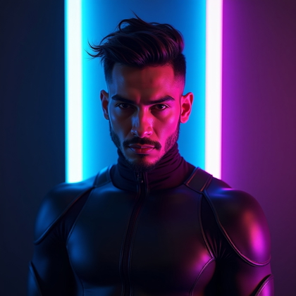
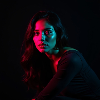
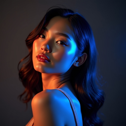
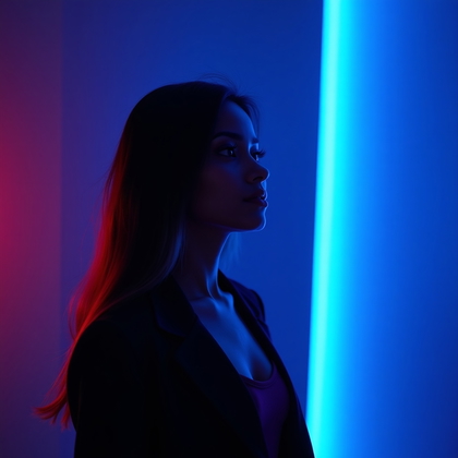
Here the main face light is neutral or very soft. The gels sit behind or to the side as rim lights. They hit the edges of the hair, shoulders, and jawline. The benefit is that you keep natural or clean skin tone on the face, but you still get strong color and shape around the outline.
In AI, this is one of the most effective setups for “expensive” looking portraits. You ask for “neutral key light on face, strong colored gel rim lights from behind, edge lighting on hair and shoulders.” This gives you a clear face, readable features, and intense color along the sides. It makes the subject pop from the background and adds depth without turning skin into a neon mess.
Low-Power Subtle Gel Accents (Not Just Neon Overkill)
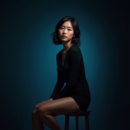
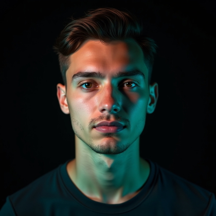
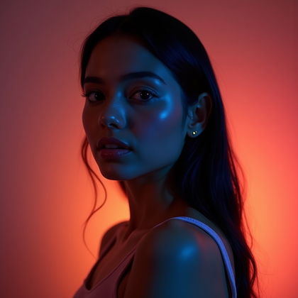
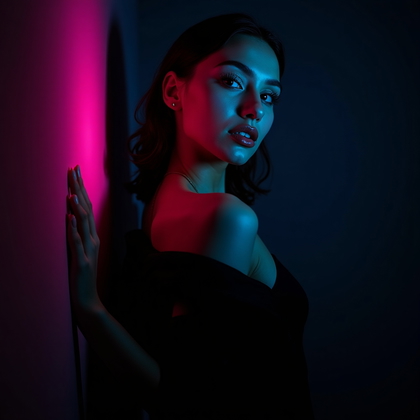
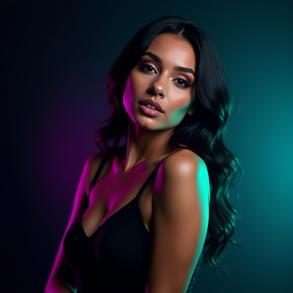
Most people push gels too hard. Full saturation. Pure neon. In real studios, subtle gels are powerful. Low-power gels add a faint color shift to shadows, hairlines, and the background. This creates a cinematic mood that does not scream “effect.” It looks controlled and high-end.
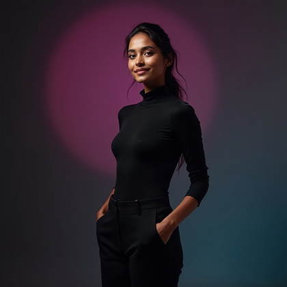
In AI, you get this by saying “very subtle color gel accents, low-intensity colored light in shadows, mostly neutral lighting, soft color tint on background.” The benefit is that you can still see real skin texture and detail. You can use stronger expressions and complex clothing without the color fighting everything. This style works when you want mood but still need natural faces or realistic branding.
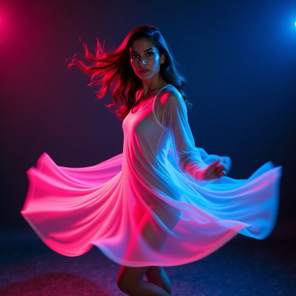
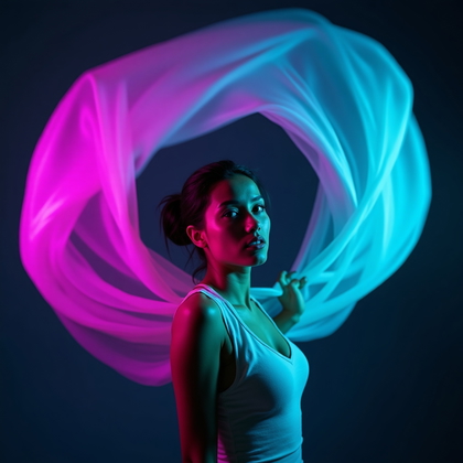
Dynamic Movement Gel Portraits (Hair, Fabric, Micro-Action)
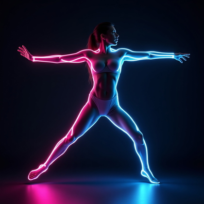
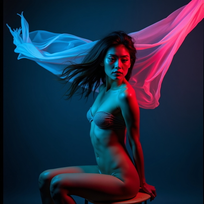
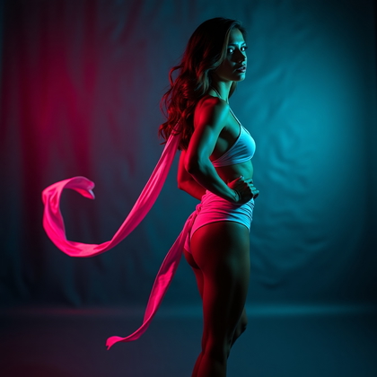
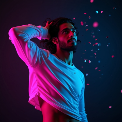
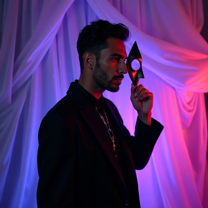
Static gel portraits can look flat and dead. Movement inside gel gradients creates energy. Hair moving through different colors. Fabric flowing from one hue into another. A slight head turn that shifts how each gel hits the face. This turns gels from simple color into motion and life.
With AI, you push for “dynamic movement, hair in motion, fabric flowing, motion blur in colored light, gel gradients across the body.” This setup is effective when you want intensity and action. The color trails, streaks, and shifts make the scene feel alive. You get more interesting shapes, more believable energy, and portraits that look like still frames from a music video or fashion campaign.
Color Story Portrait (Intentional Palette: 2–3 Colors Max)
Most AI users throw in too many colors. That looks cheap and random. High-end work uses a strict palette. Two or three colors only. Gels, clothing, makeup, and sometimes background all follow this palette. This is not about “cool colors everywhere.” It is about color discipline.
In practice, you pick a story. For example, teal, black, and silver for a cold futuristic mood. Or magenta, red, and gold for a warm intense mood. You prompt “limited color palette, 2–3 colors only, wardrobe and makeup matching gel colors, cohesive color story.” This makes the portrait look designed, not accidental. It reads as professional and intentional, and AI will echo that structure.
Expression and Attitude Under Gels
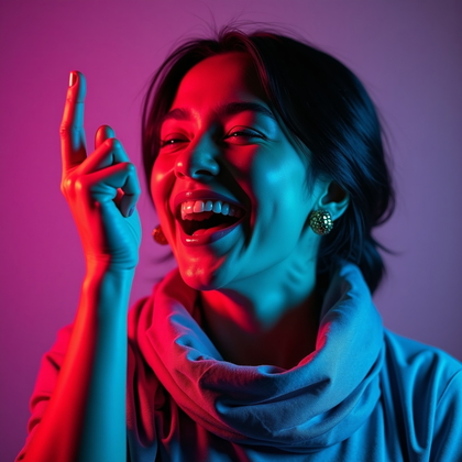
Color alone does not define the mood. Expression must match the gel story. Hard red and blue with a soft smiling face often feels wrong. Soft pastel gels with an angry expression also clash. You need to control both color and attitude in the prompt.
For AI, you say “strong colored gels, serious expression, intense gaze” or “soft pastel gels, playful expression, gentle smile.” Same lighting, different faces. The benefit is direct. When expression and color align, the portrait hits harder. It is easier to read the emotion. You get less confusion and more punch. The gels become an amplifier of attitude, not random decoration.
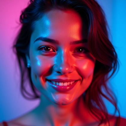
Face-Only Close-Up with Intense Gels
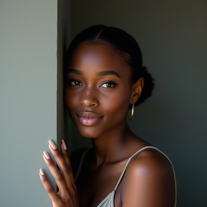
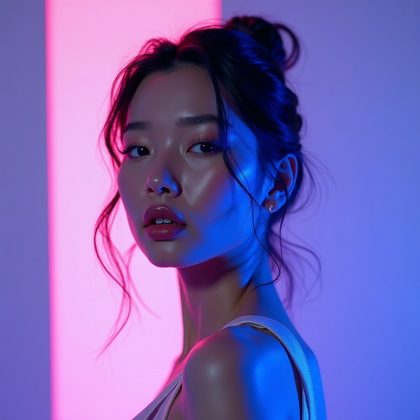
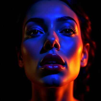
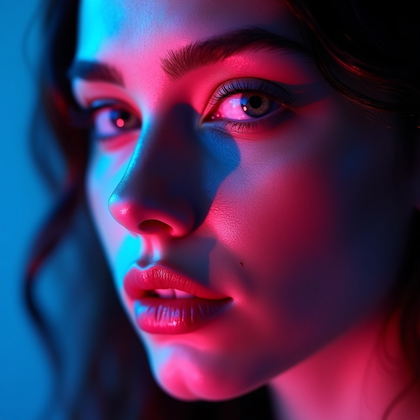
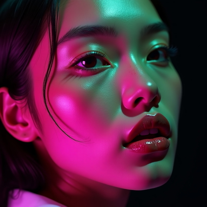
This is a tight crop. Face filling the frame. Strong gels, close details, visible pores, and micro-shadows. This setup forces the AI to handle fine skin detail under heavy color. You see how the model treats highlights, shadows, and transitions around the eyes, nose, and lips.
In your prompt, you use “extreme close-up portrait, intense gel lighting on face, pores and skin texture visible, dramatic color transitions.” The benefit is precision. You test how far you can push saturation and contrast before the face breaks. This is powerful for beauty, makeup-heavy looks, and stylized character portraits where the face is the main subject.
Character and Concept Portraits Built Around Gel Color
Here, gels are not just an effect. They are the core of the character. Cyberpunk in teal and magenta. Neon noir in deep blue and red. Pop-art with bold primary colors. You design the concept first. Then you lock the gel palette to that concept.
In AI, you specify both: “cyberpunk character portrait, teal and magenta gels, futuristic wardrobe matching lighting” or “neon noir detective, red and blue gels, dramatic shadowed face.” The benefit is a clear identity. The color, clothing, and lighting all say the same thing. This gives you strong character branding and memorable visuals that feel like they belong to a specific world.
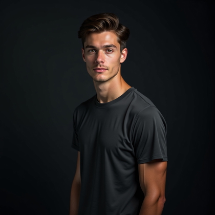
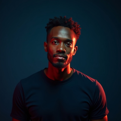
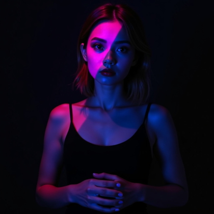
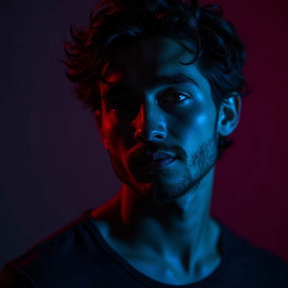
High-Contrast Moody Gel Portrait (Shadows Embraced)
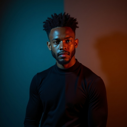
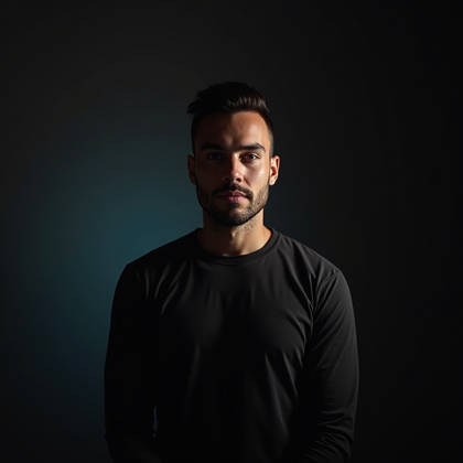
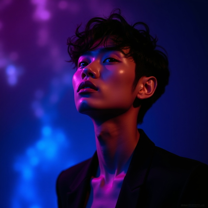
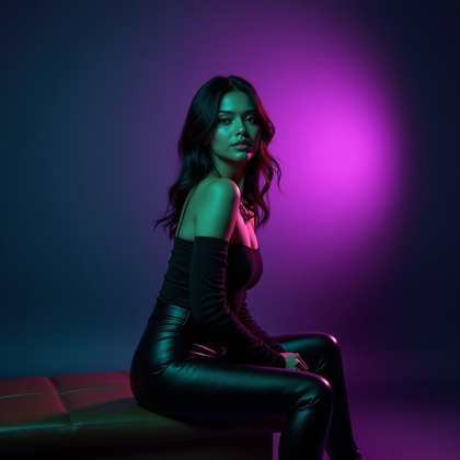
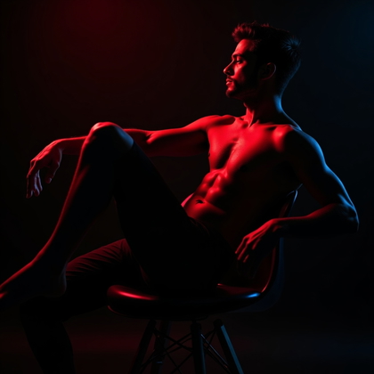
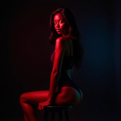
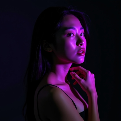
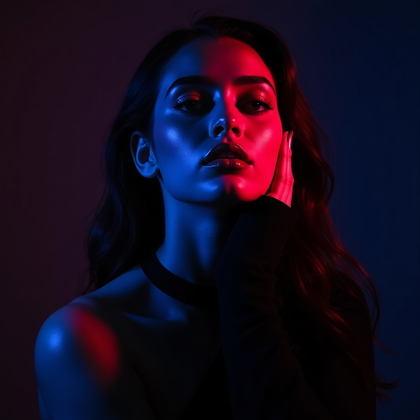
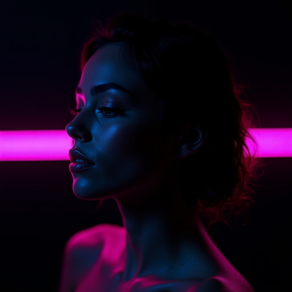
Not every portrait needs bright, safe lighting. High-contrast gel portraits use deep shadows and strong color blocks. Large parts of the face fall into darkness. Only certain planes are lit. This makes the image feel dramatic, secretive, or intense. You let darkness work for you instead of fighting it.
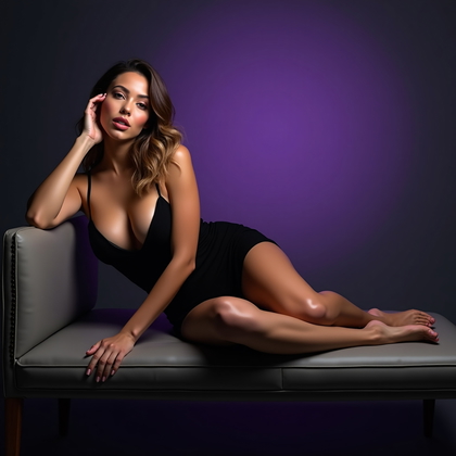
For AI, ask for “low-key lighting, deep shadows, dramatic gel accents, only partial face illuminated.” This reduces clutter. The eyes, cheekbones, and mouth become key points. The rest fades away. The benefit is a moody, cinematic feel that looks serious and powerful. It also hides flaws and focuses the viewer on the strongest features.
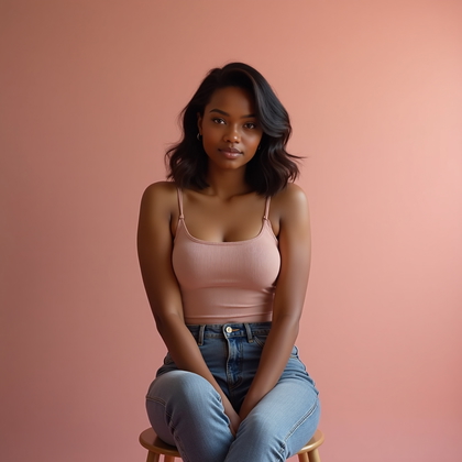
Gel Portrait on Dark vs. Light Backgrounds
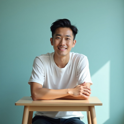
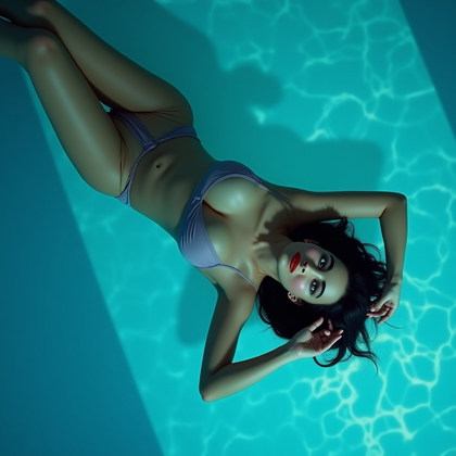
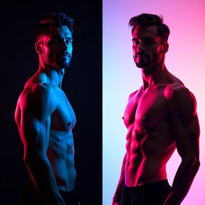
The same gels behave very differently on dark and light backgrounds. On black, colors look deeper and more saturated. Edges glow and stand out. On white or light backgrounds, gels spread more, look softer, and can wash out if not controlled. You need to decide what you want: dense color or airy color.
In AI prompts, you can test both with “black background, strong gel lighting, rich saturated color” and “white background, soft gel wash, airy pastel effect.” The benefit is flexibility. Dark backgrounds help you carve shapes and silhouettes. Light backgrounds support clean editorial looks and softer moods. Understanding this difference lets you control chaos instead of being surprised by how the AI renders color.
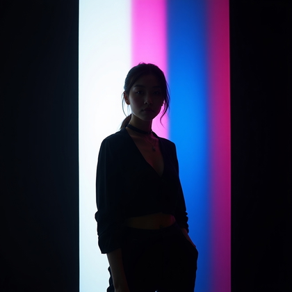
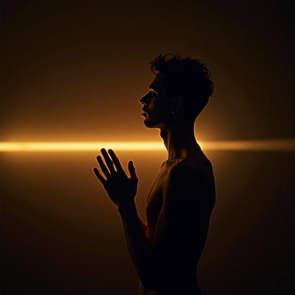
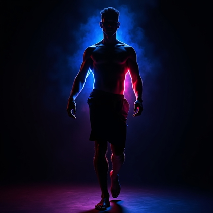
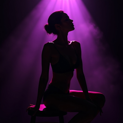
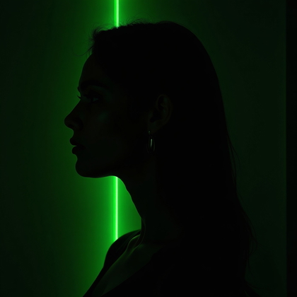
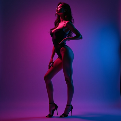
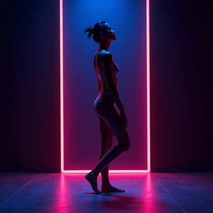
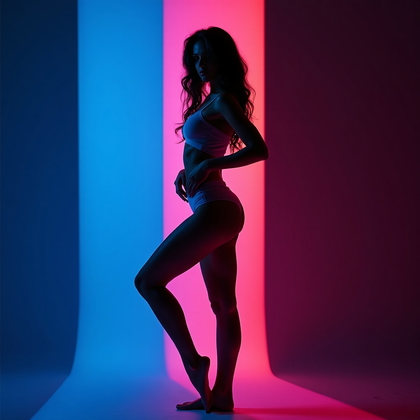
Silhouette and Semi-Silhouette Gel Portraits
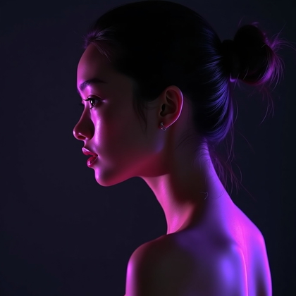
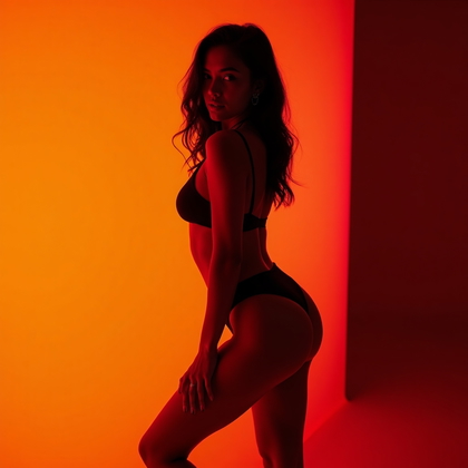
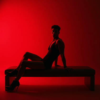
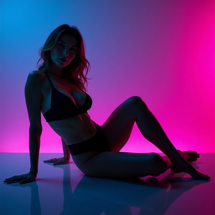
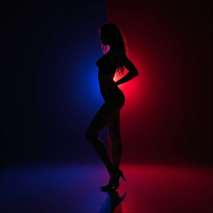
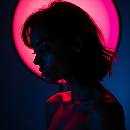
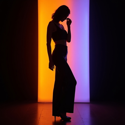
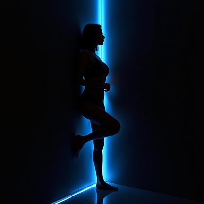
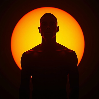
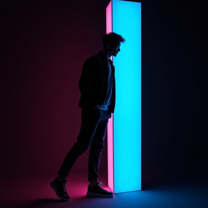
Not every portrait needs full facial detail. Silhouette and semi-silhouette setups use strong backlight or side light with gels. The result is a graphic shape instead of a detailed face. You see outline, profile, and gesture more than features. This is powerful for mystery and iconic shapes.
For AI, you say “gel backlighting, silhouette portrait, minimal facial detail, strong colored outline” or “semi-silhouette, side-lit with colored gels, profile emphasized.” The benefit is simplicity and impact. It also helps when you want to avoid skin detail or create stylized poster-like images. The focus moves to shape and pose, with color as the main voice.
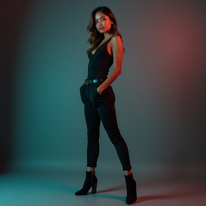
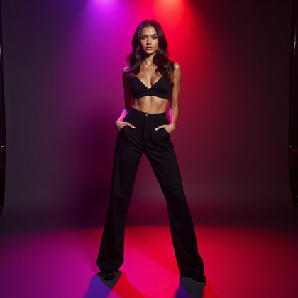
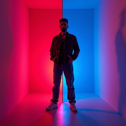
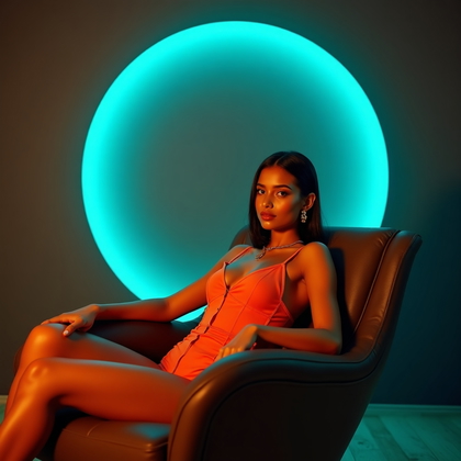
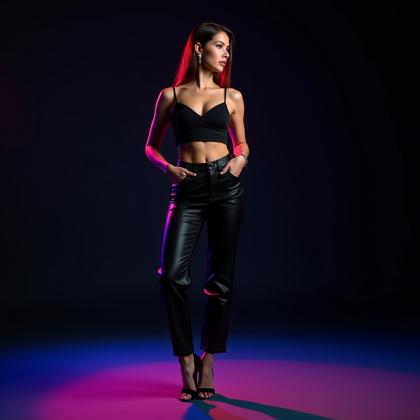
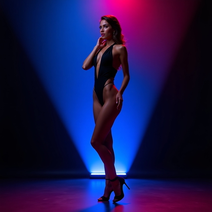
Full-Body Gel Portrait with Controlled Spill
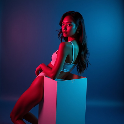
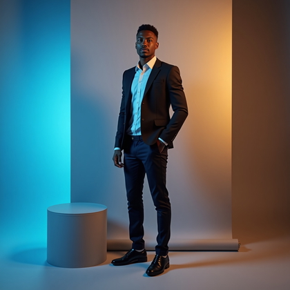
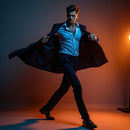
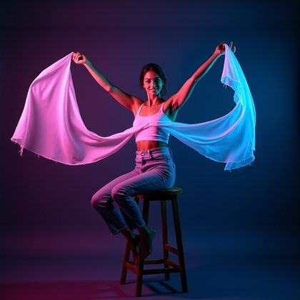
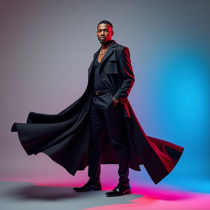
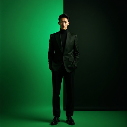
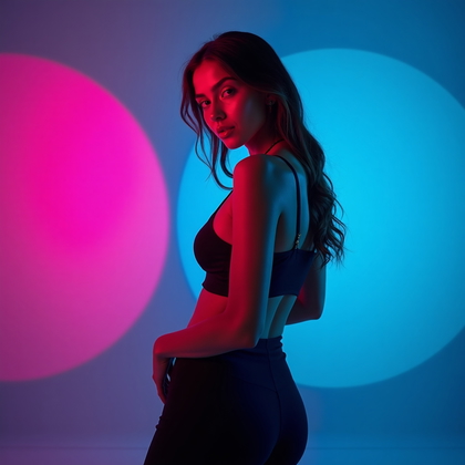
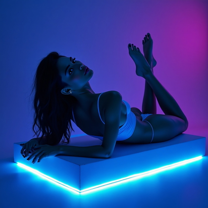
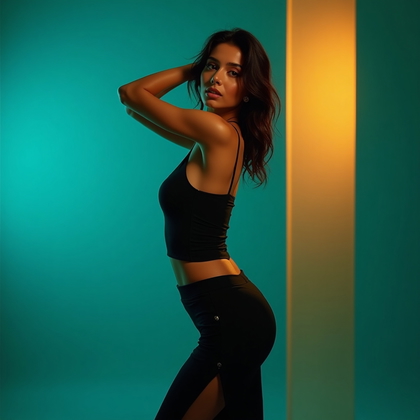
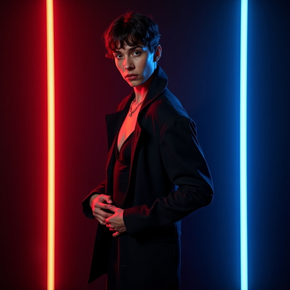
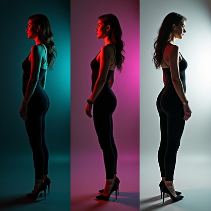
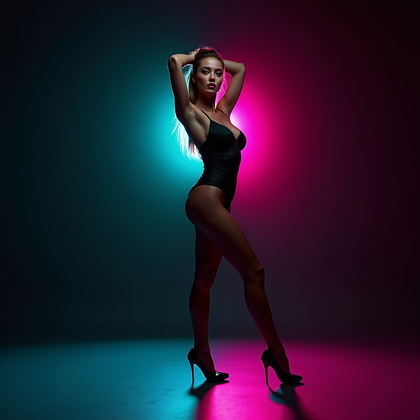
Full-body under gels is harder. Color can spill everywhere and destroy contrast. Real studios use flags and careful placement to keep gels from flooding the whole scene. For AI, you need to be clear that the figure is shaped by color, but the background stays controlled, not chaotic.
Use prompts like “full-body studio portrait, controlled gel lighting on subject, minimal color spill on background, clean separation between subject and environment.” The benefit is clarity. You get strong color on clothing, limbs, and edges, but the environment does not turn into a noisy rainbow. This is effective for fashion, character design, and posters where you need to see the whole outfit and stance.
Conclusion: Use Gels with Intent, Not Guesswork
Studio gel lighting in AI is not about random bright color. It is about structure. You learned how one-color headshots give you a baseline. How split-color gels sculpt the face. How rim lights add shape without destroying skin tone. How subtle gels create cinematic mood instead of cheap neon.
You saw how movement, expression, and strict color palettes change the impact of the portrait. You saw how background tone, silhouettes, and full-body control can make or break your final image. When you combine these ideas in your prompts, you stop relying on luck. You start building portraits with clear light, clear color, and clear purpose.
Pick one setup from this guide. Test it in AI with precise language. Adjust color, intensity, and background on purpose. Then push into the next setup. This is how you build a real visual style with studio gel lighting, not just another random “cool” image.

